TCU Area Second-Story Addition
Fort Worth, Texas
services provided
Custom Design
finishes used
Exterior Paint:
• Brick – Sherwin Williams Alabaster
• Trim – Sherwin Williams Gray Area
Exterior Accents:
• Oil-rubbed bronze and black metal finishes for contrast
Interior Paint Colors:
• Walls & Trim – Swiss Coffee (varied sheen for depth)
• Ceilings – Bright White
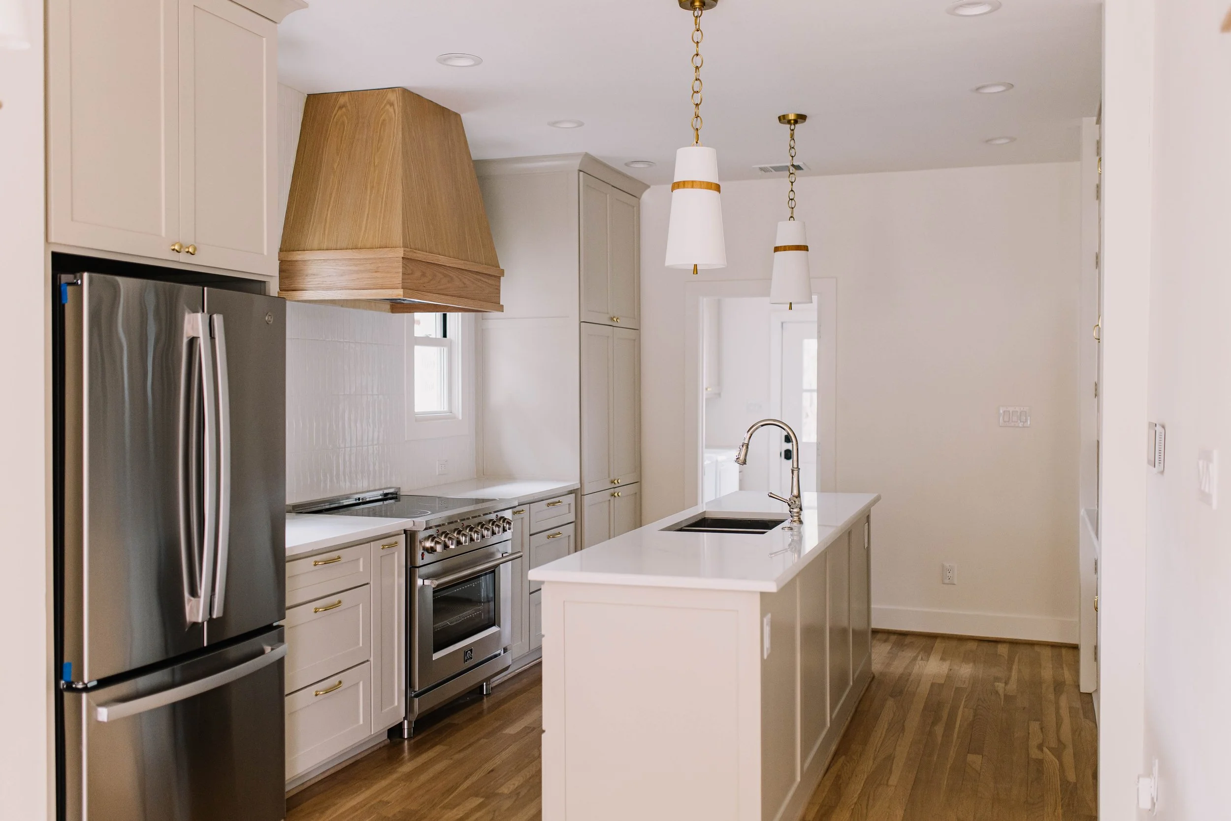
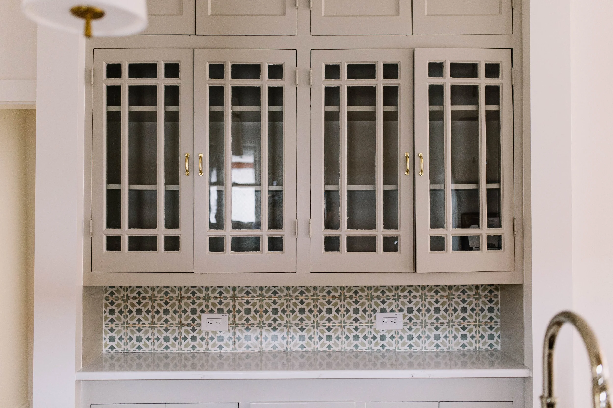
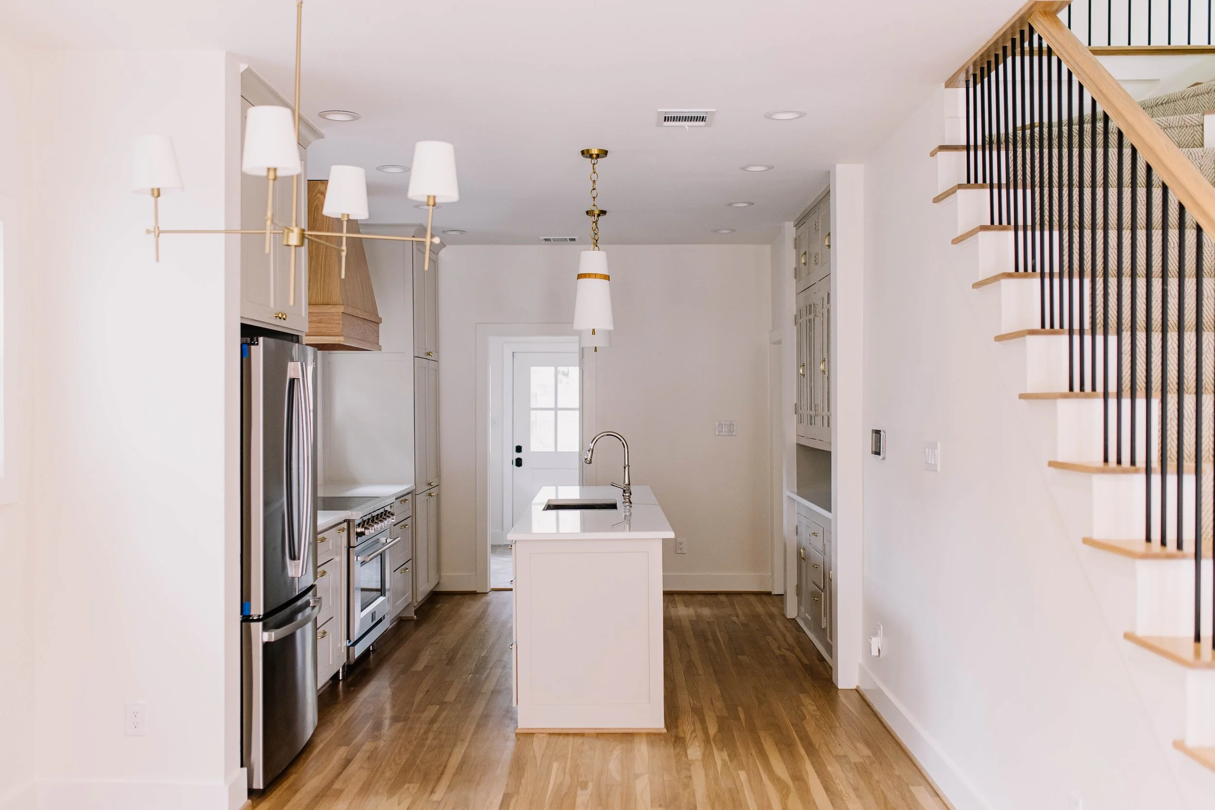
Kitchen:
• Cabinet Color – Sherwin Williams Shiitake
• Wall Color – Swiss Coffee
• Backsplash – Seaport Arctic White 2x10 subway tile (straight stack)
• Vent Hood – Stained wood for warm contrast
• Cabinet Hardware – Aged brass
• Plumbing Fixtures – Stainless steel + polished nickel
• Island Pendants – Cortland Small Pendant by Visual Comfort
• Range Wall Sconces – Fairview Traditional Single Sconce by Rejuvenation (Aged Brass)
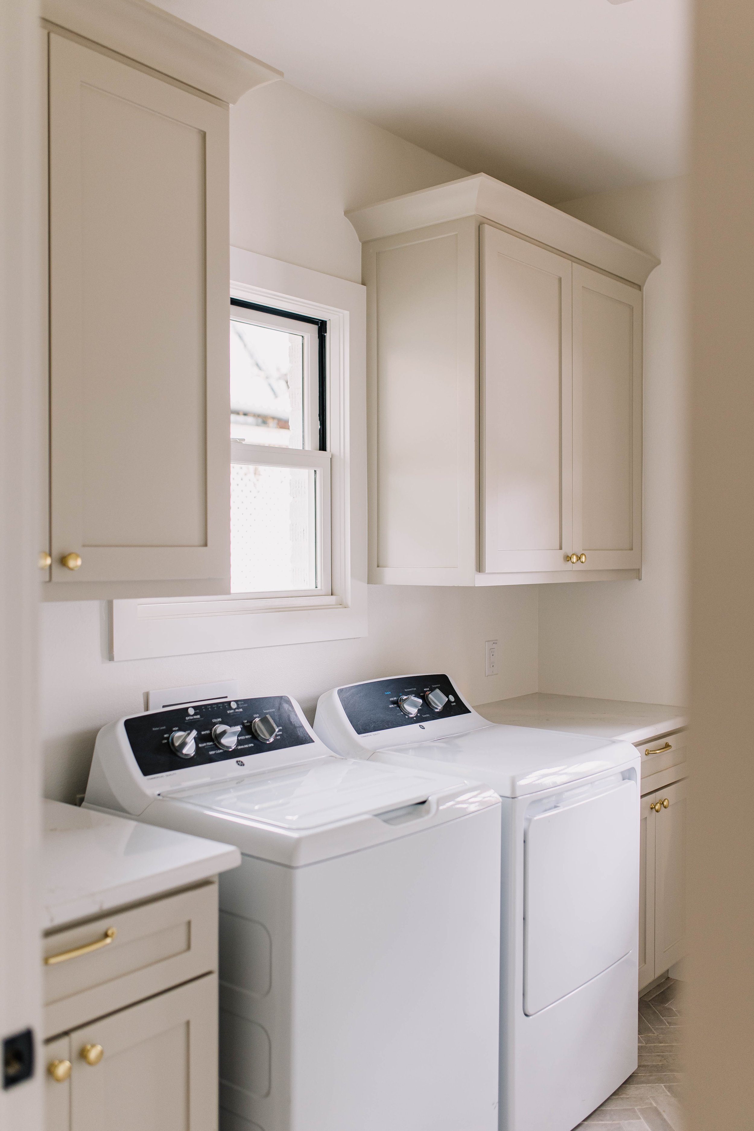
Laundry Room:
• Cabinet Color – Shiitake
• Hardware – Aged brass
• Brick Tile – Home Depot
▸ Perimeter: Soldier stack
▸ Interior field: Herringbone pattern
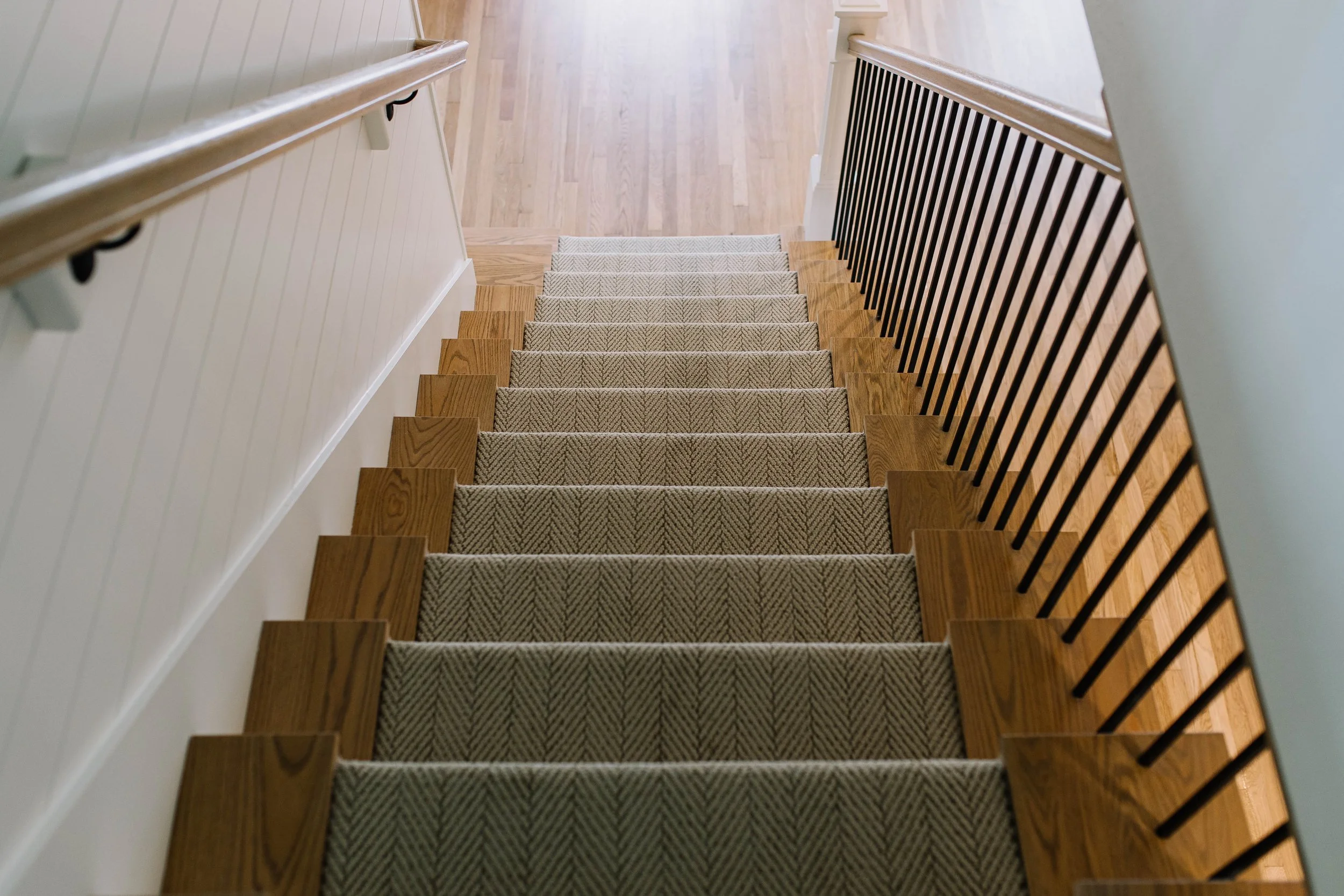
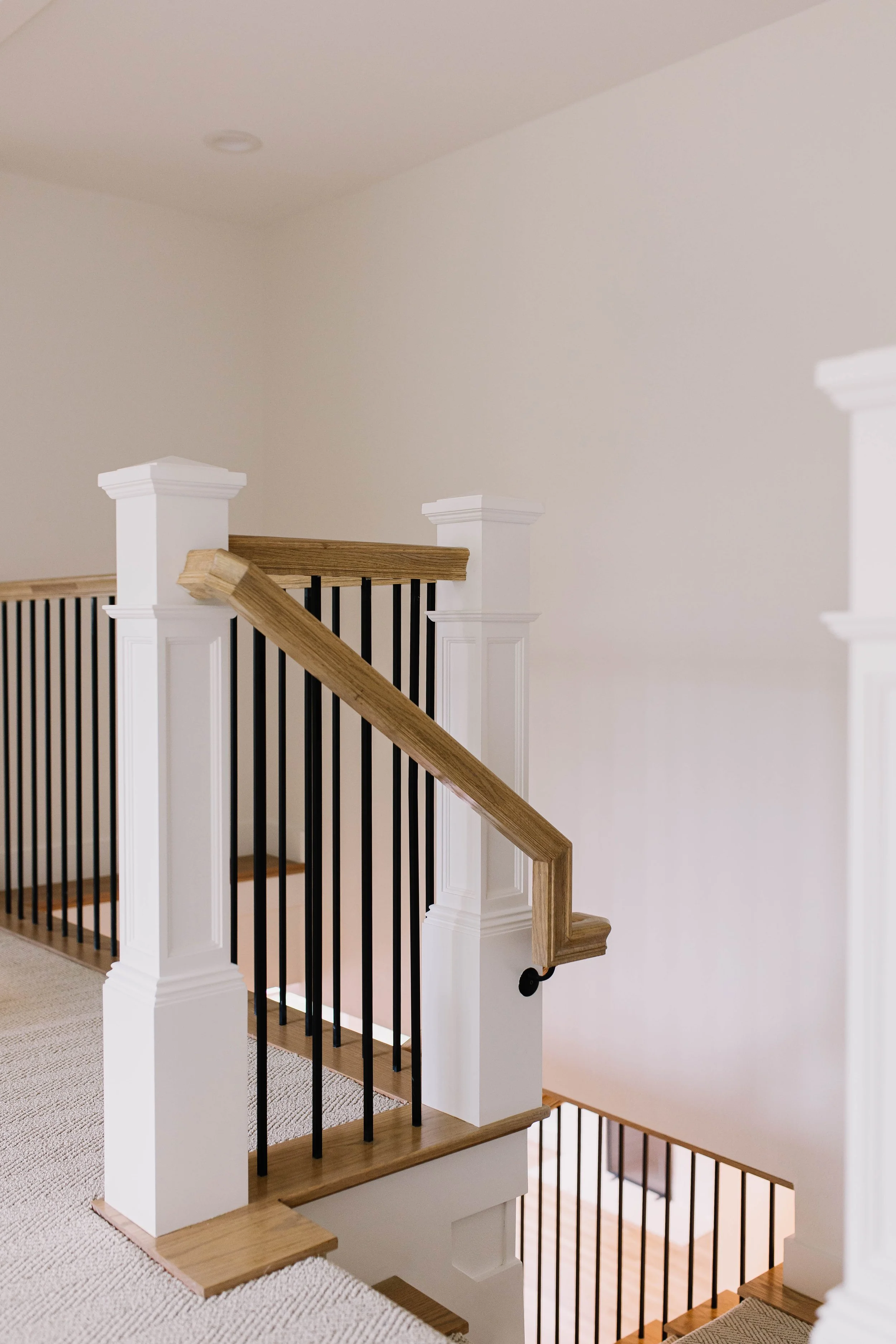
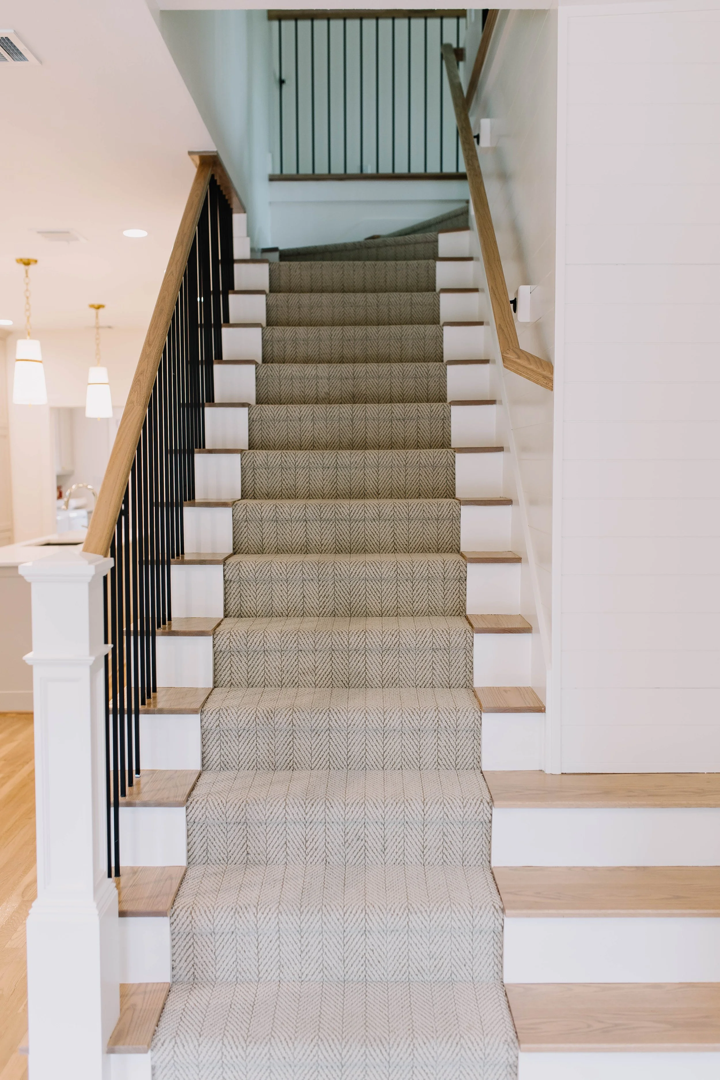
Staircase:
• Hardwood steps with neutral carpet runner in a chevron/herringbone pattern
• Custom iron railing
• Carpet continues throughout entire second floor
Powder Room:
• Feature Tile – Bedrosians marble deco tile
• Plumbing Fixtures – Polished nickel
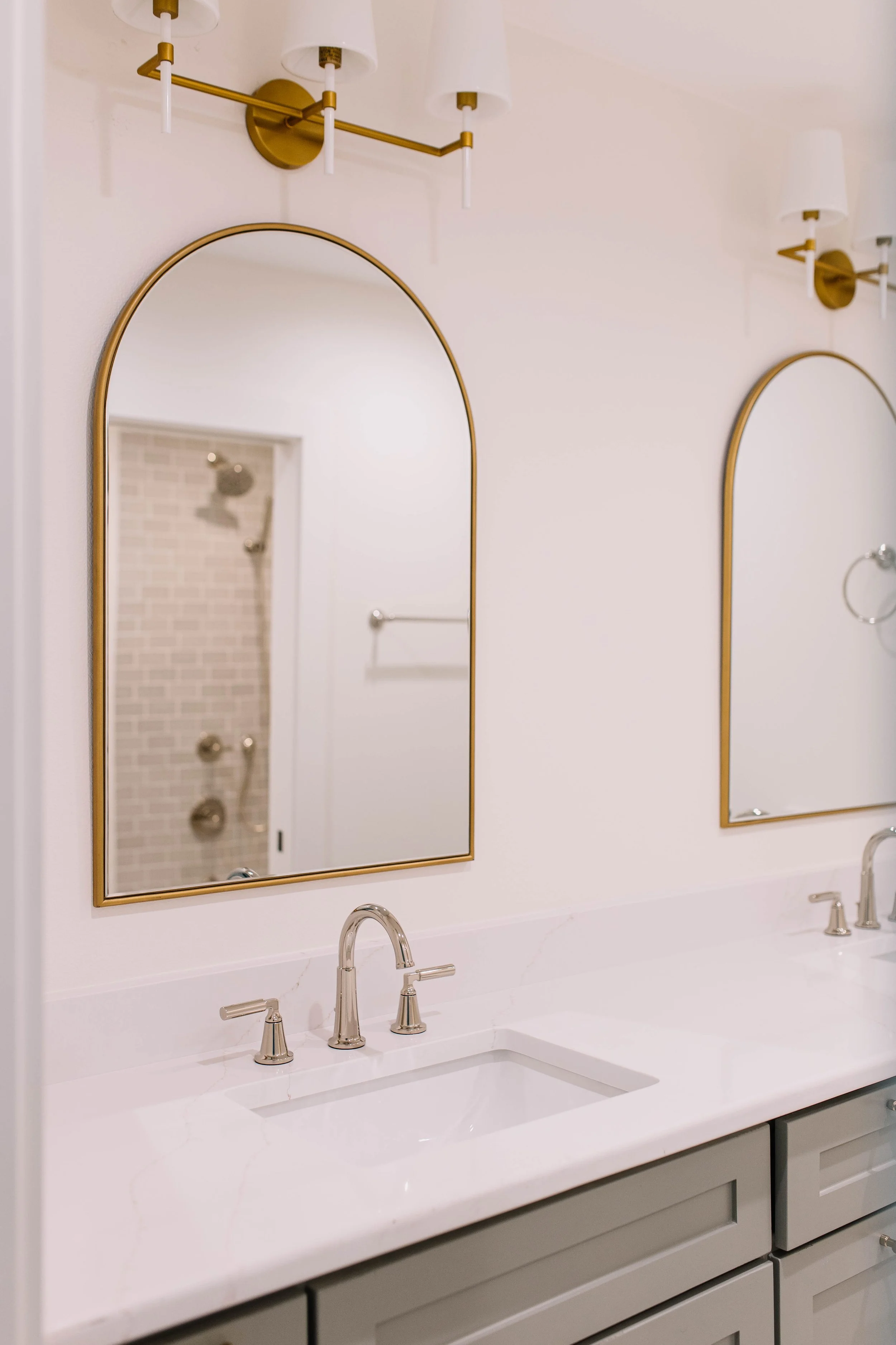
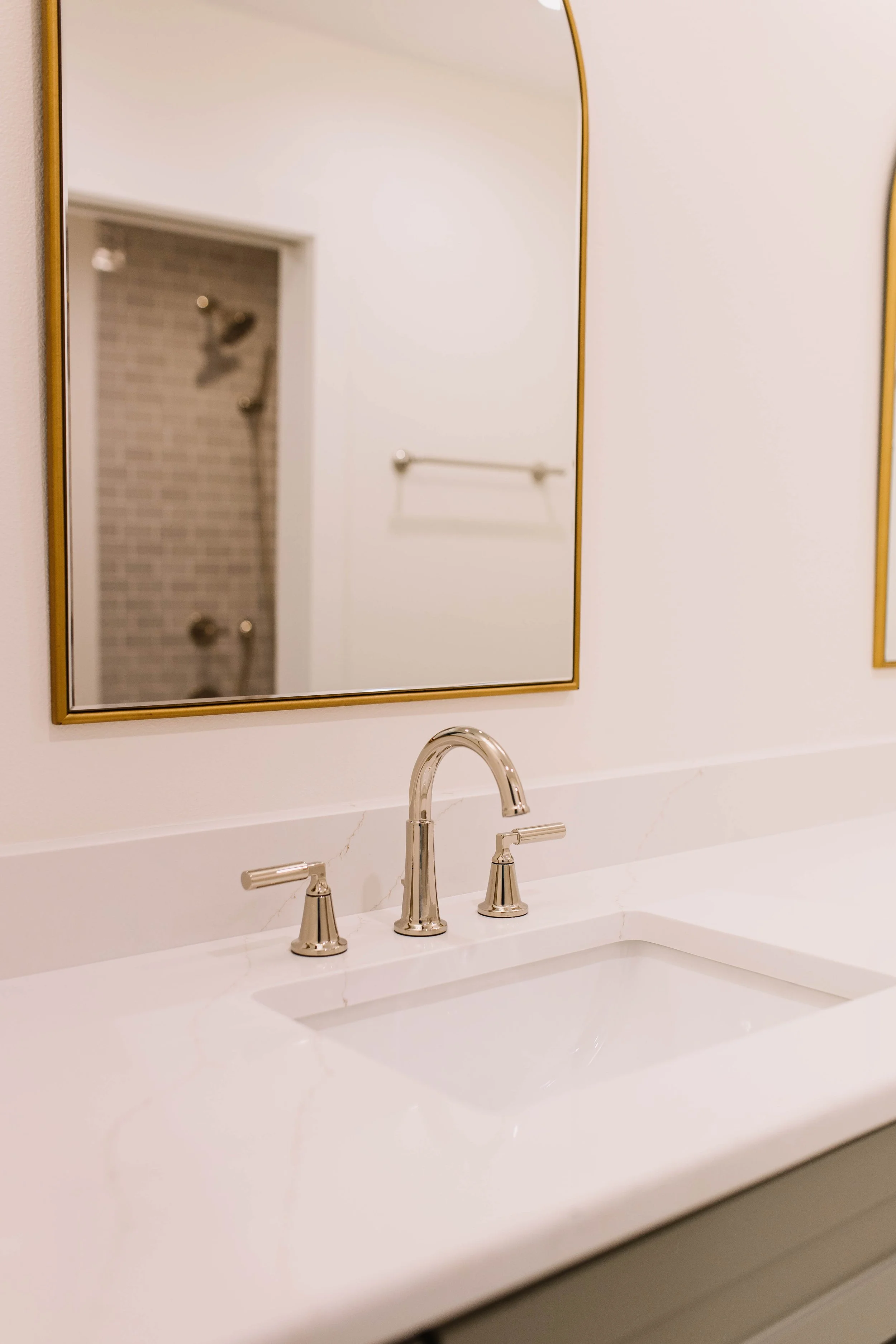
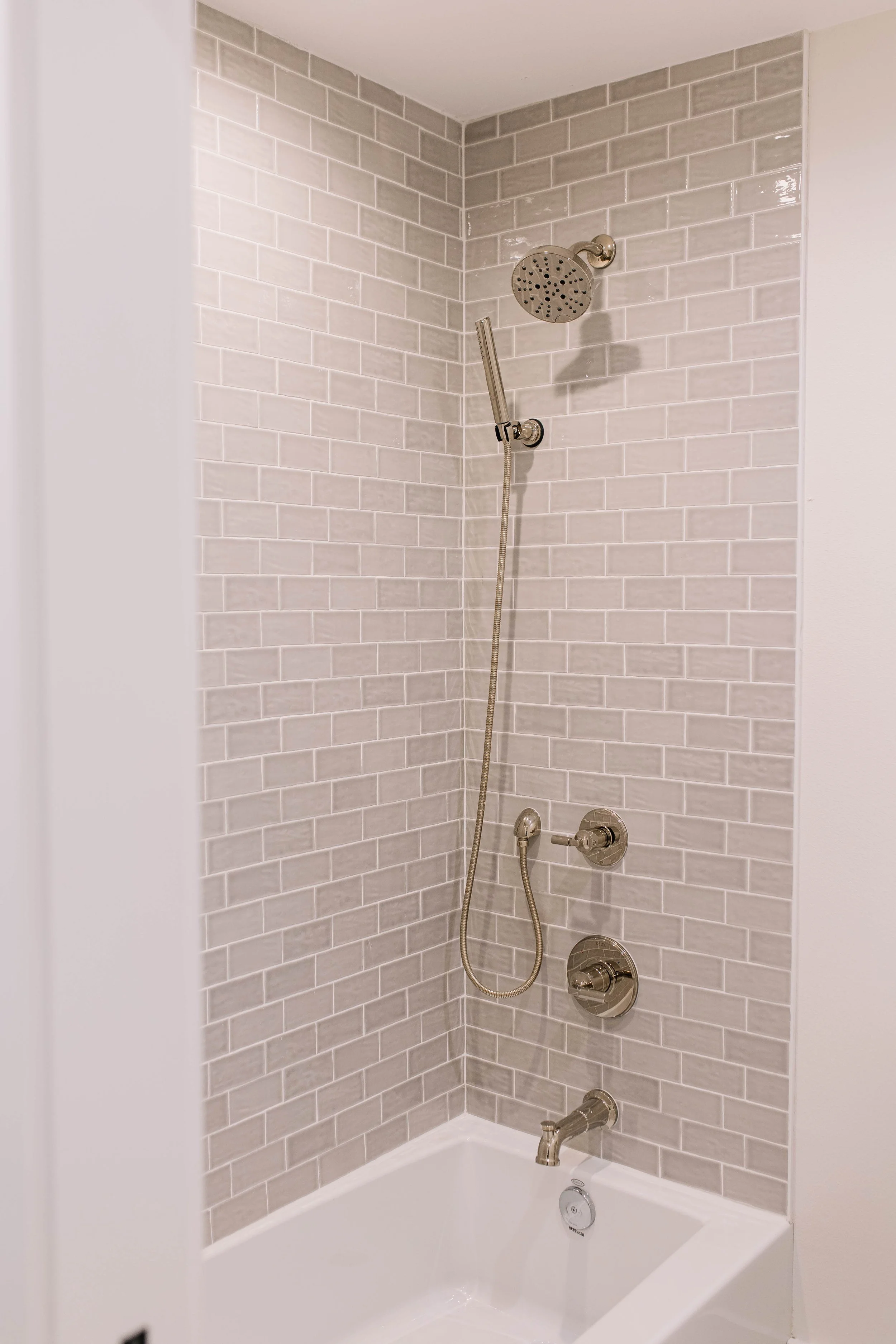
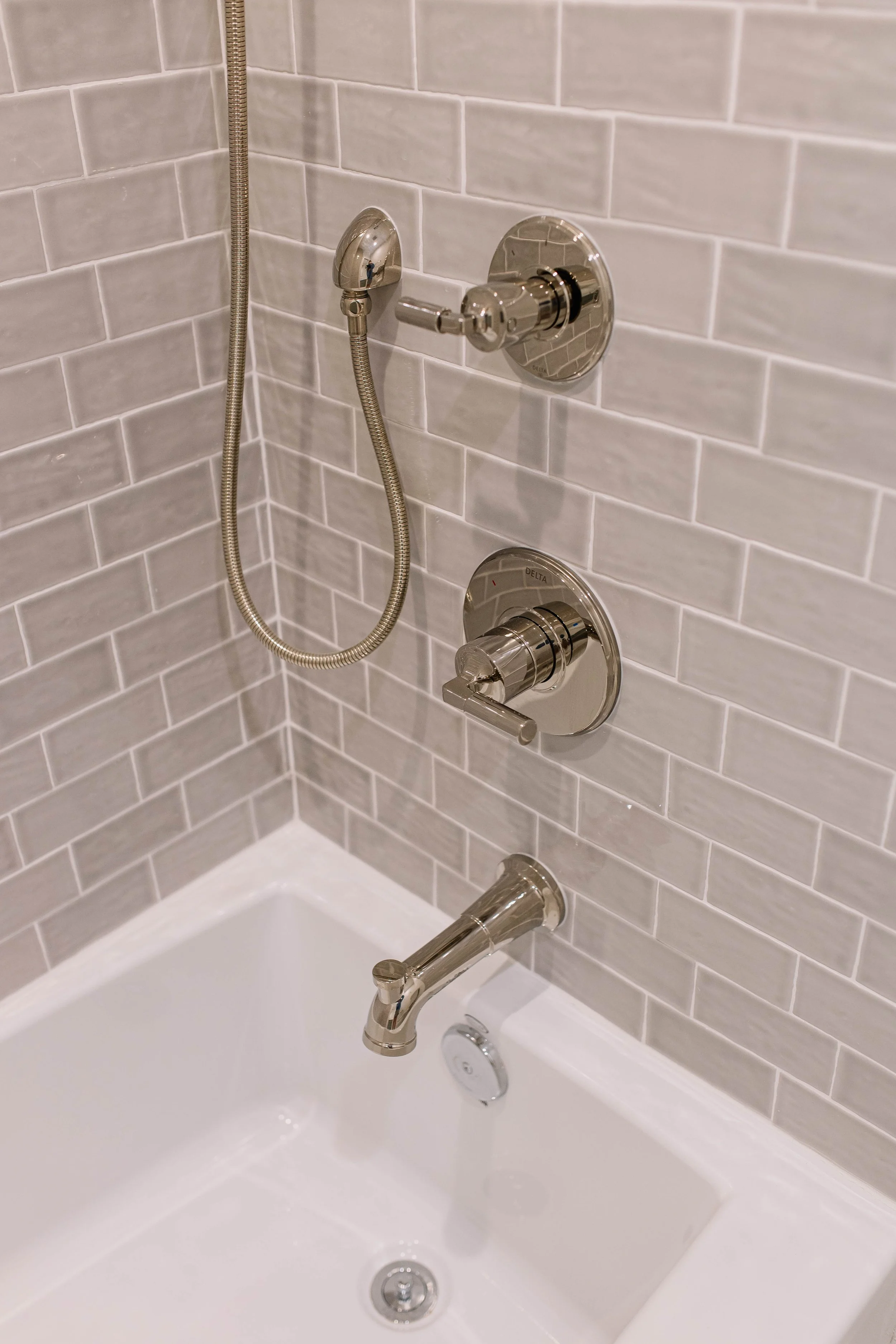
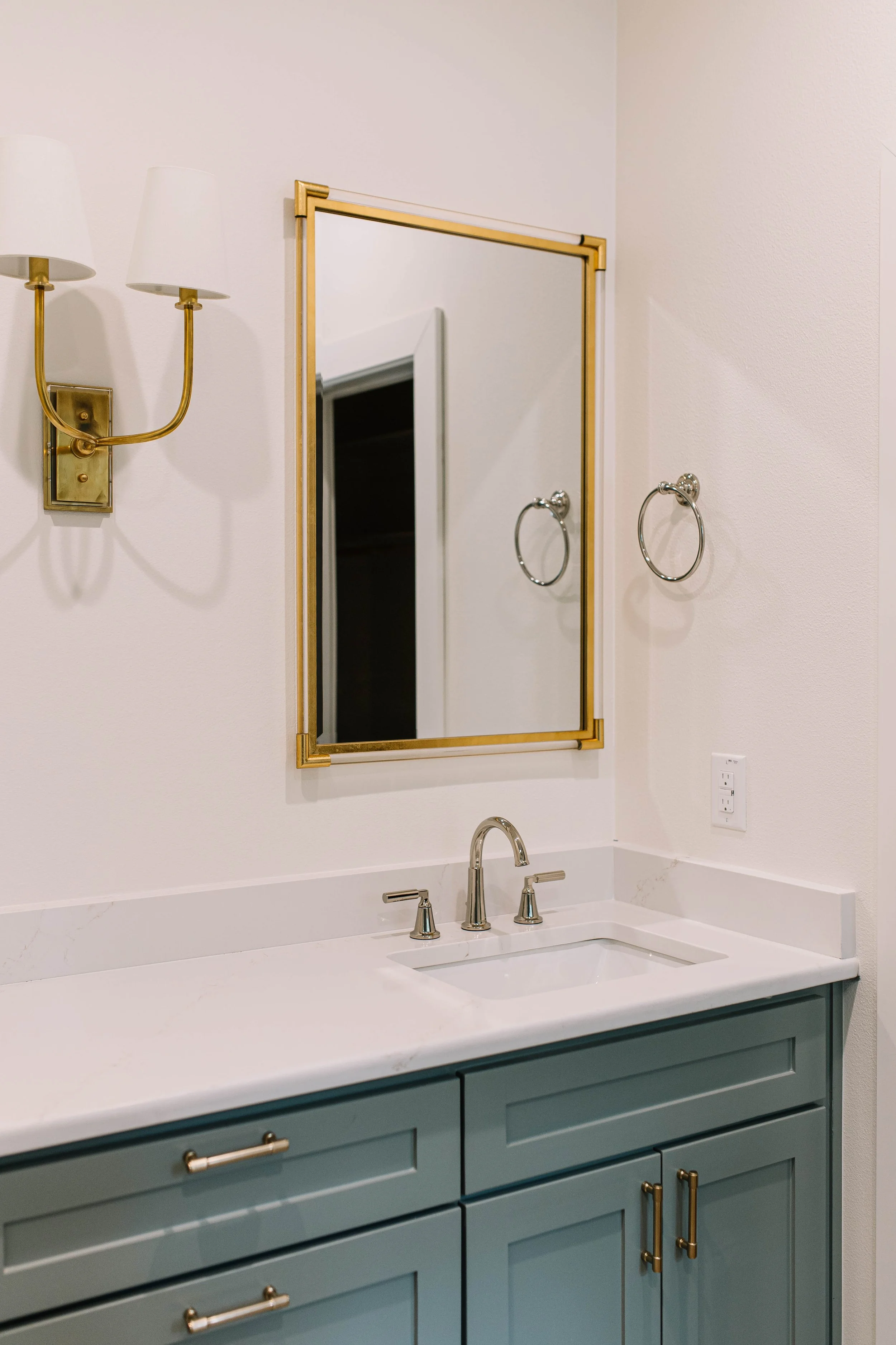
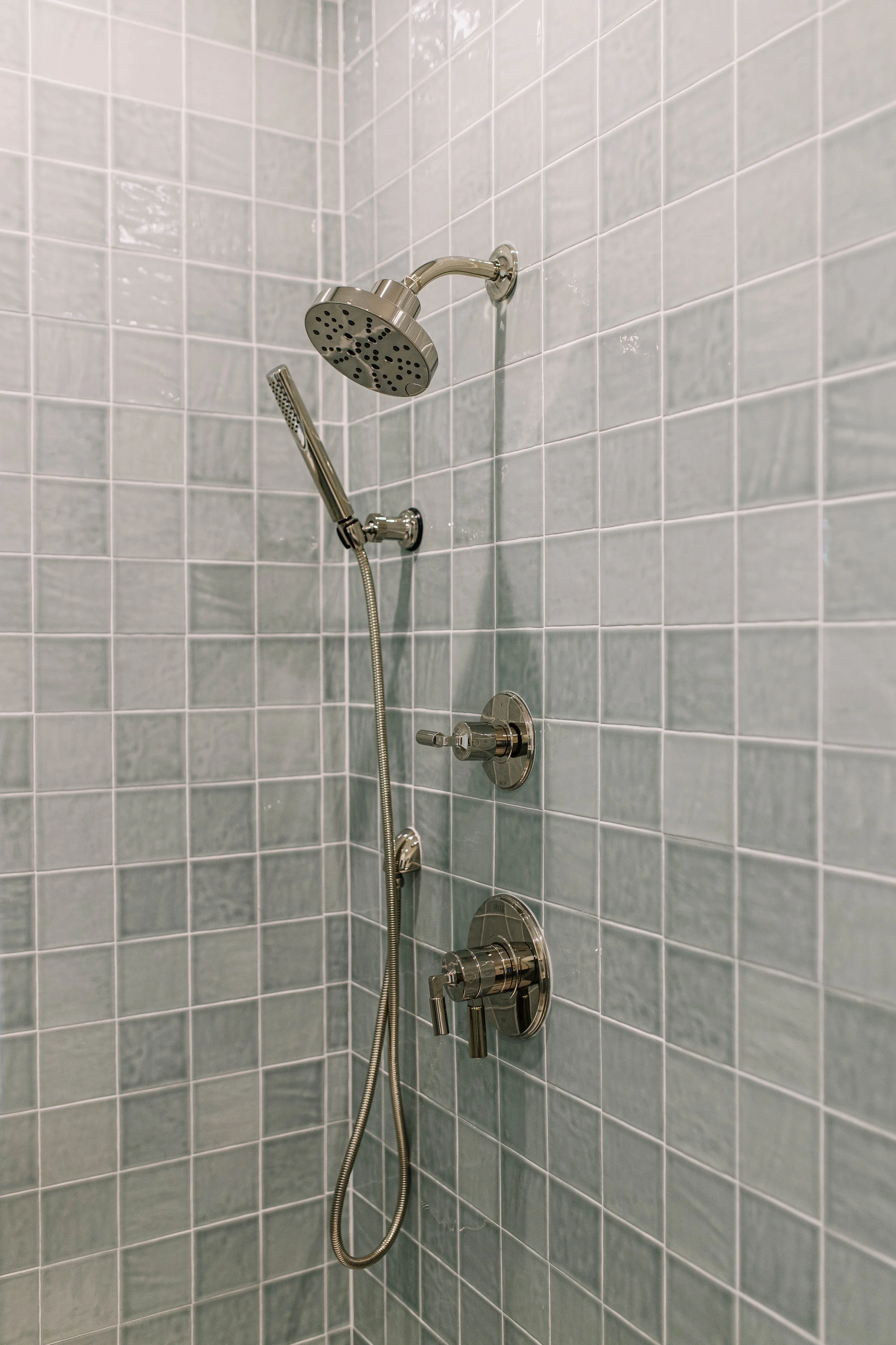
Primary Bathroom:
• Cabinet Color – Acacia Haze
• Countertops – Extellic Quartz
• Flooring – Home Depot brick tile
• Shower Walls – Bedrosians Marron 4x4 in Aloe Green (straight stack)
• Shower Floor – Bedrosians white penny tile
• Plumbing Fixtures – Delta Cassidy
• Hardware – Aged brass
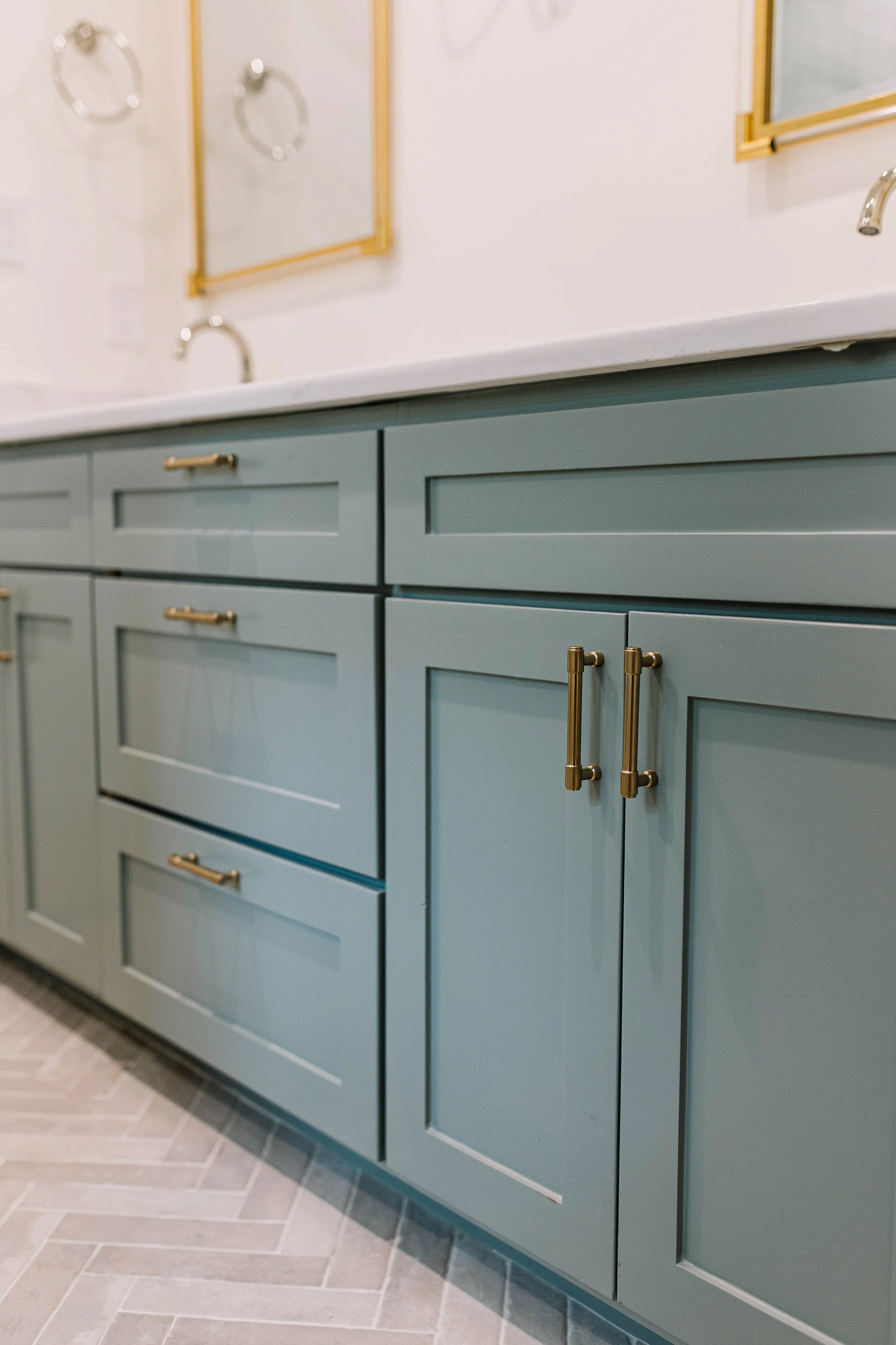
Secondary Bathrooms:
• Cabinet Color – Oil Cloth
• Countertops – Stella Gold Quartz
• Tile – Bedrosians Marron subway tile in Pebble Gray (30% offset bricklay)
• Hardware – Aged brass
Project overview
Some homes shout “new.” This one whispers “meant to be here.”
Tucked just a few blocks from TCU, you can see the campus from the front yard.
But you’d never guess this home hadn’t always stood exactly like this.
When a family from Georgia reached out, they had a clear dream:
Create a home where their daughter could live with her sorority sisters—
a space that felt safe, smart, and soulful…
but also an investment that made sense long-term.
Originally, the house was a modest one-story—three bedrooms, two baths.
Plenty of charm. Not nearly enough space.
So we got to work.
We added a full second story.
Expanded it to five bedrooms, three and a half baths.
Made room for memories, late-night study sessions, and all the in-between moments college life brings.
But the goal wasn’t just more.
It was better.
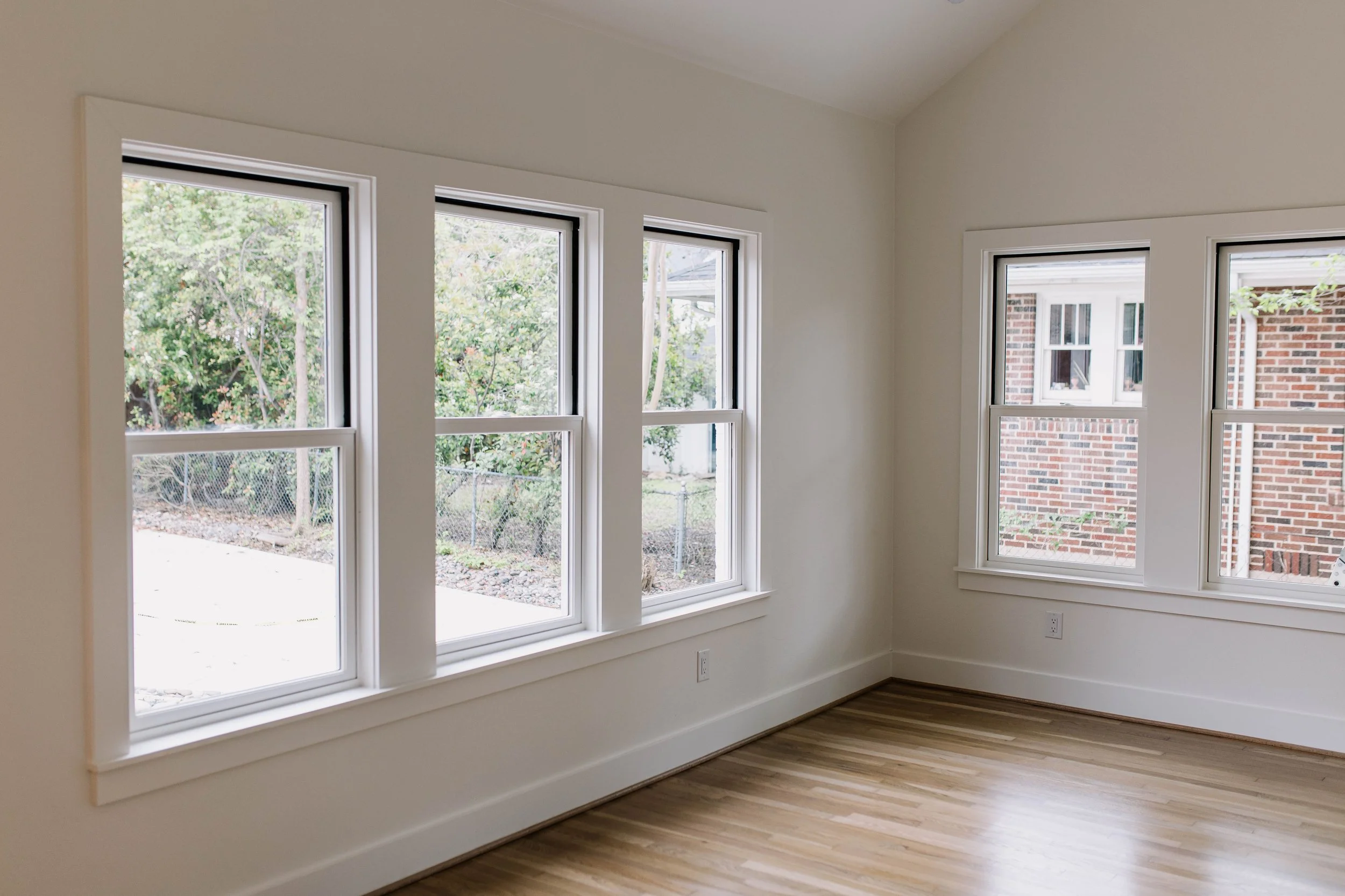
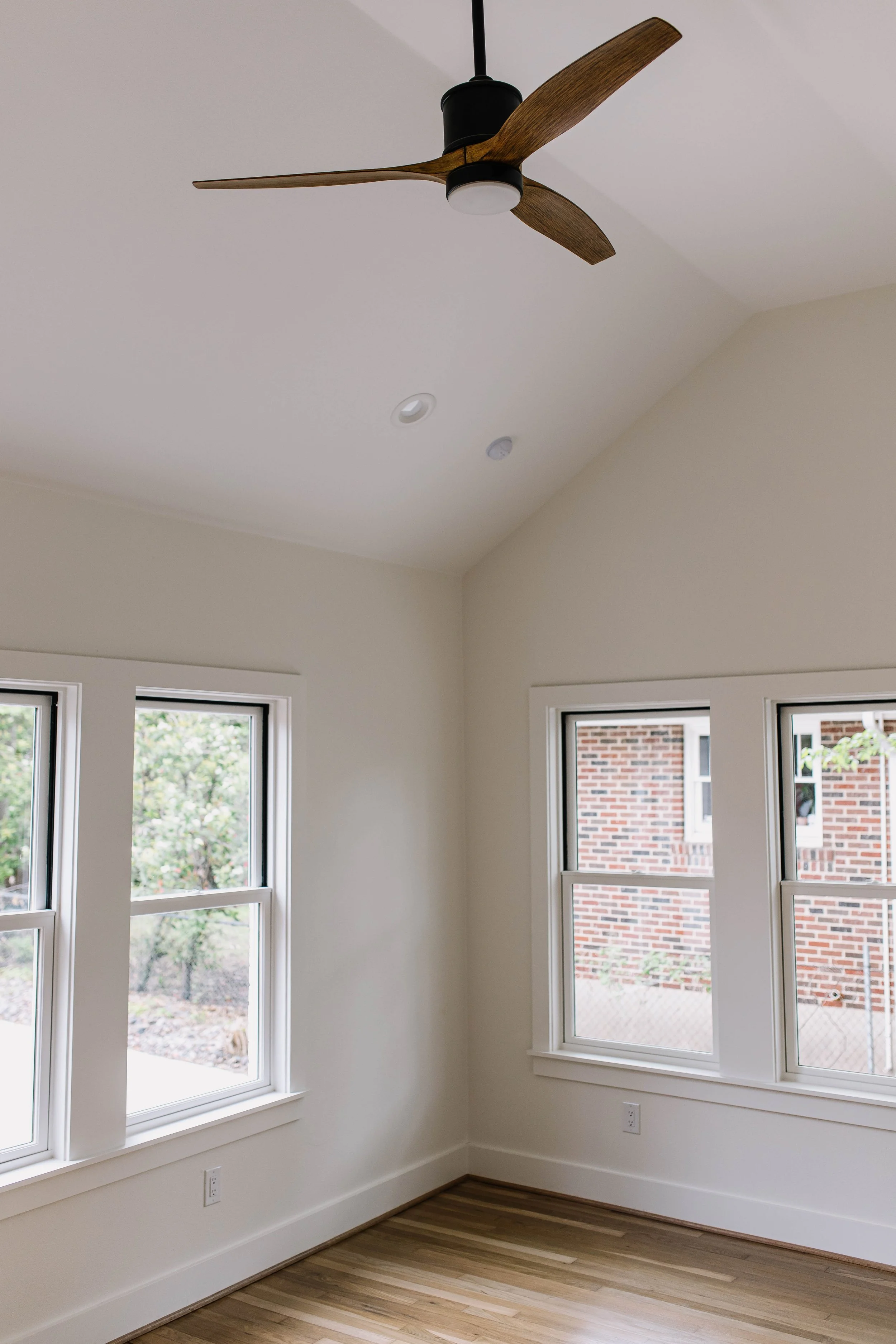
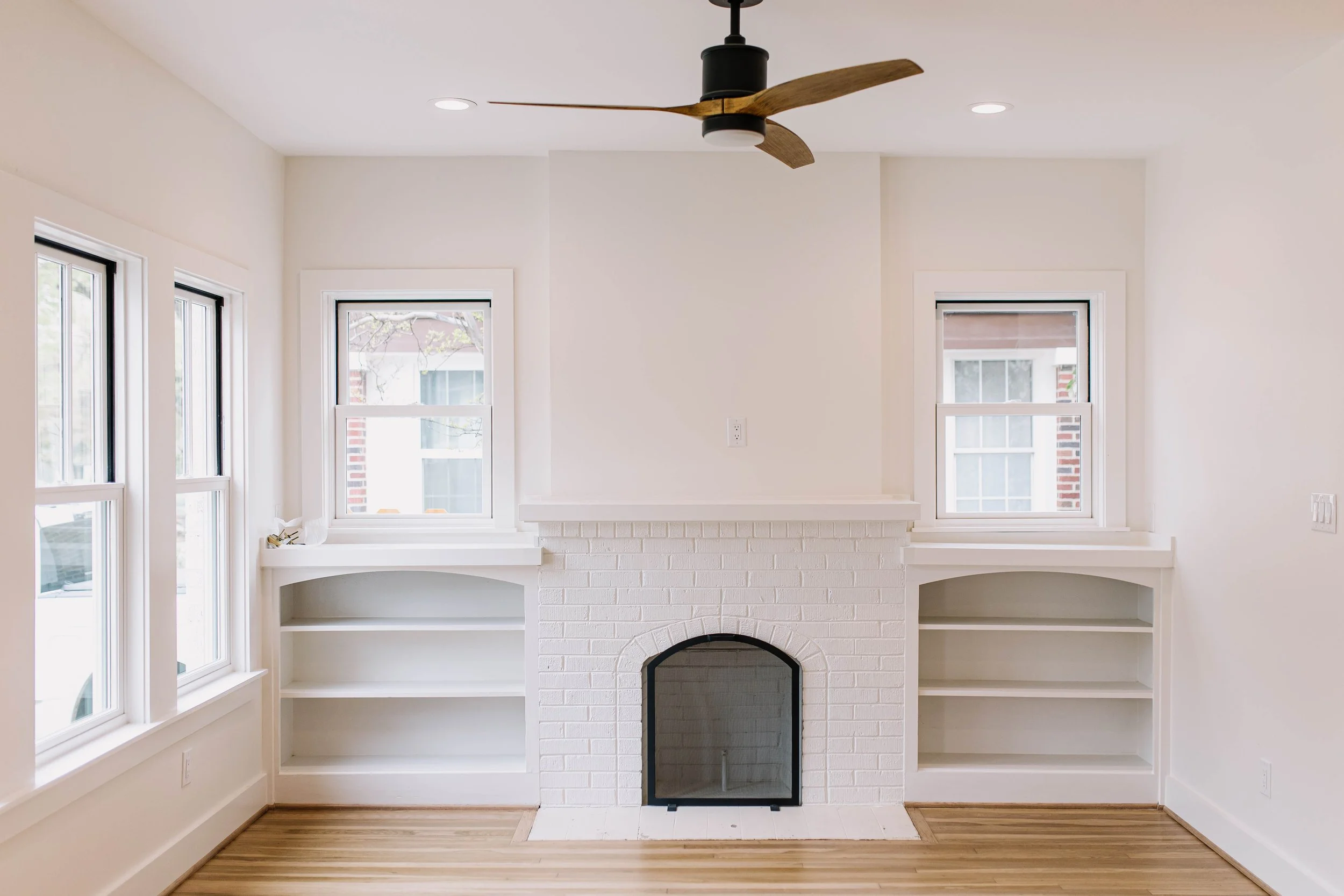
We didn’t want this house to stick out like a flashy modern build.
We wanted it to feel like it belonged.
Like it had always been here—rooted in the rhythm of the neighborhood.
So we chose materials with intention.
We preserved the bones where we could.
And every design decision was made with one question in mind:
“How do we honor what’s here while building something new?”
That’s the tension we love to hold.
Not just creating homes that impress—
but homes that make sense.
Homes that serve real people and real stories.
For the Woody family, this isn’t just a house near TCU.
It’s a gift to their daughter.
A space for community.
A future-forward investment with an old-soul feel.
And for us?
It’s another reminder that good design isn’t always about standing out.
Sometimes it’s about knowing when to blend in—with beauty, on purpose.