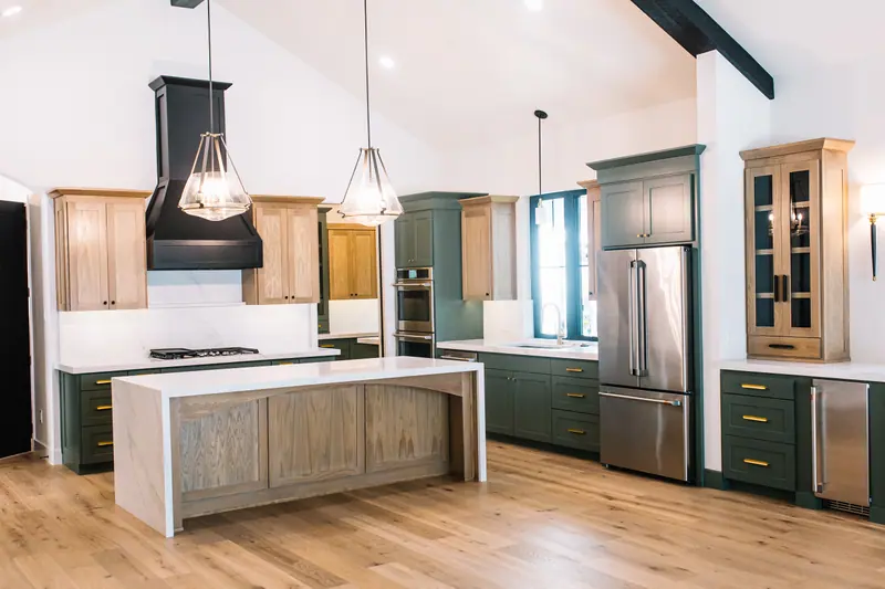
There's a moment that happens when you walk into a really well-designed room. You can't always put your finger on why it feels different. The furniture's nice, sure. The lighting's good. But something about the space itself — the walls, the way it wraps around you, the mood — just feels intentional. Custom. Like someone really thought about it.
Half the time, the secret is paint. And specifically, it's a move called color drenching.
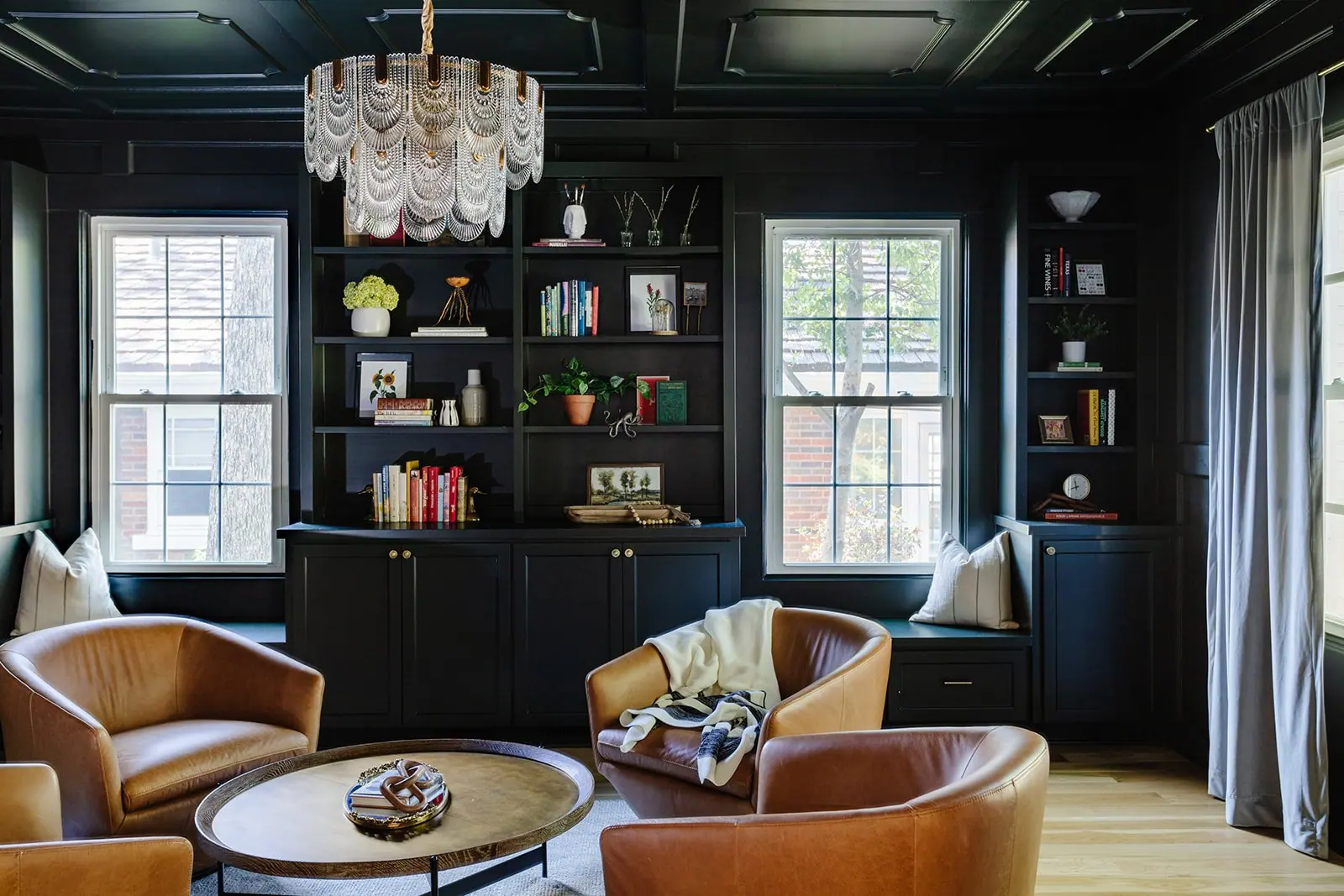
If you've never heard the term, color drenching is when you paint everything in a room the same color. The walls. The trim. The ceiling. The doors. Sometimes even the built-ins. Either the exact same color, or shades that live in the same tone family. It's a single, immersive wash of color that wraps the whole room in one cohesive vibe.
It's dramatic. It's bold. It's one of our absolute favorite design moves at 6th Ave. And here's the kicker: it doesn't cost any more than a normal paint job.
Same paint. Same painter. Same labor. The brushes hit different surfaces, but the bill looks roughly the same. And the result? It's like someone hired a designer.
So if you've been thinking about painting a room — or you're staring down a renovation and trying to figure out where the impact moves are — let's dig in. Because this might be the highest-leverage decision you make.
Whoever Started the "All-White Trim" Trend Owes Us a Word
For decades, the default has been: walls one color, trim crisp white, ceiling crisp white, doors crisp white. That's just how houses got painted. Builders did it. Designers did it. Your parents' house probably did it. Your house probably does it right now.
We don't know exactly when this became gospel, but we'd like a word with whoever started it. Because for a lot of rooms, white trim and white ceilings actively work against you. They chop the space up. They draw your eye to every corner and edge. They flatten whatever mood the wall color is trying to create.
Here's the test. Imagine a deep moody blue living room. Walls a rich, slightly stormy navy. Now picture it with bright white crown molding outlining the top, white baseboards slicing across the bottom, white casing framing every door and window, and a stark white ceiling overhead. What happens?
The blue stops being immersive. It becomes a stripe. A patch. A panel of color, framed and contained on all sides by white. The whole "moody library / cozy lounge / dramatic retreat" energy you were going for? Gone. Neutered. The white lines are doing all the talking and the blue is just an accent.
That's what white-everywhere does to bold color. It contains it. It tames it. It politely cordons it off so it doesn't get too far. Which is fine if you're going for light, airy, default new-build vibes. But if you're going for intentional, custom, designer-touched — it's working against you.
What Color Drenching Actually Does
Color drenching does the opposite. It removes the lines.
When the walls, trim, ceiling, and doors all share a tone, your eye stops getting interrupted. There's no high-contrast frame around every architectural feature. The color just... wraps. The room becomes one continuous experience instead of a wall, plus some trim, plus a ceiling, plus a door.
A few things happen when you do this:
The room feels bigger. This is the counterintuitive part — people assume dark colors make rooms feel smaller. They don't, when they're drenched. White trim is what makes dark rooms feel small, because it constantly reminds you where the boundaries are. When the boundaries blur, the space expands. Suddenly you're not in a small room with dark walls. You're in a mood.
Architectural detail becomes elegant instead of busy. If you've got beautiful crown molding or paneled doors or detailed casing, drenching them in the wall color lets you appreciate the form without screaming about it in white. The detail is still there. It's just sophisticated about it.
Cheap or builder-grade trim disappears. This is one of our favorite tricks. If your trim is the standard 1990s/2000s builder-grade stuff and you've been thinking it looks dated — drench it. The eye stops noticing it. The bones of the room read as deliberate instead of generic.
Awkward proportions get rescued. Low ceilings? A weirdly placed soffit? A built-in nook that doesn't quite work? When everything is one color, awkwardness blends in instead of standing out. White ceilings on a low room actually emphasize how low it is. Drench that ceiling and it disappears upward.
The room reads as designed. This is the part that's hard to put into words but easy to feel. There's something about an entirely drenched room that telegraphs someone made decisions here. It looks intentional in a way default white never does.
When to Drench (And When Maybe Not)
Color drenching isn't a universal answer. It's a powerful tool, and like all powerful tools, it works best when you use it on purpose.
Drenching tends to thrive in rooms where you want mood: studies, libraries, primary bedrooms, powder rooms, dining rooms, dens, playrooms, dramatic entryways. Anywhere you want the room to feel like something — cozy, moody, fun, immersive — drenching delivers.
Powder rooms are basically made for drenching. They're small, you don't spend a lot of time in them, and a bold drench turns a forgettable utility room into the most memorable room in the house. We tell clients all the time: if you've never tried drenching, do your powder room first. It's the lowest stakes, highest reward bet in residential design.
Drenching can be trickier in rooms where you want maximum brightness and openness — sometimes a kitchen, sometimes a sunroom, sometimes a wide-open great room. (Though plenty of designers drench those too — there are no real rules, just trade-offs.) For light-filled rooms, you might choose a soft, warm drench (creamy beige, soft greige, pale blush) instead of a moody one. The principle still works; the palette just shifts.
Generally: if you're hesitating, do a smaller room first. Powder room, office, kid's room, primary bedroom. Build confidence. Then go bigger.