If we had a dollar for every time a homeowner sat across from us and said, "We've outgrown this house, we need something bigger" — only to walk out an hour later realizing the actual problem was the layout — we'd have a lot of dollars.
Don't get us wrong. Sometimes you really do need a bigger house. Some families genuinely run out of room and the only answer is more square footage. We help people make that move all the time, and there's nothing wrong with it.
But more often than not? The house isn't the problem. The floor plan is.
You're not actually short on space. You're short on useful space. The kitchen is fine in theory but doesn't function. The storage doesn't exist where you actually need it. There's clutter with nowhere to go. There are rooms that don't serve a clear purpose. The whole thing technically works — but it doesn't feel great day to day.
That gap, between technically working and actually working, is almost always a layout issue. And layout issues can usually be fixed without a single wall coming down — or with the right wall coming down at exactly the right moment.
We just finished a project in Westcliff that tells this story better than any explanation ever could. So let's dig in. Because if you've been daydreaming about a bigger house, this might save you from buying one you don't need.
The House: A 1930s Charmer Near TCU That Wasn't Quite Working
The house was an old 1930s home in Westcliff, the kind of neighborhood near TCU where the trees are huge, the lots are deep, and the houses have actual character. Hardwood floors. Original details. The kind of place that feels like Fort Worth.
It also had a problem. The layout just didn't work.
Rooms felt disconnected from each other. The kitchen was awkward. There was square footage, but a lot of it was being wasted on hallways and weird transitions. The flow from one space to the next felt like a series of disconnected events rather than one cohesive home. If you've ever walked through a really old house and felt like every room had a different conversation going, you know what we mean.
The owners assumed they had two options: gut it and open it all up — or move. Those felt like the only paths forward. More space, more openness, fewer walls — that's been the default renovation playbook for the last twenty years.
We pitched a third path. And it was the opposite of what most people expect.
The Move: We Actually Chopped It Up More
Yep, you read that right. In a world where "open concept" has been the gospel since roughly 2005, we made the layout more defined, not less. We added thoughtful divisions. We carved out specific spaces. We gave rooms distinct identities instead of dissolving them into one big great room.
We know that's a little controversial. Hear us out.
Totally open concepts have real downsides that don't get talked about enough. You lose the "wow" factor that comes from rooms that feel like something. You lose storage, because storage requires walls. You lose cozy. And you lose the ability to create moments — those small, specific, intentional spaces that make a house feel layered and rich and lived-in instead of one big open void.
When everything is open, you're locked into one design decision. The kitchen, dining, and living area all have to feel like the same room because they are the same room. The lighting has to play nicely across all of it. The flooring has to be continuous. The paint has to work in every direction. Any time you try to make one zone feel different from another, you're fighting the architecture.
When you define spaces, the math flips. Each room can have its own personality, its own mood, its own story. The dining room can be moody and intimate. The kitchen can be bright and functional. The library can be deep and warm. They don't have to compete with each other or compromise for each other. They just have to be themselves.
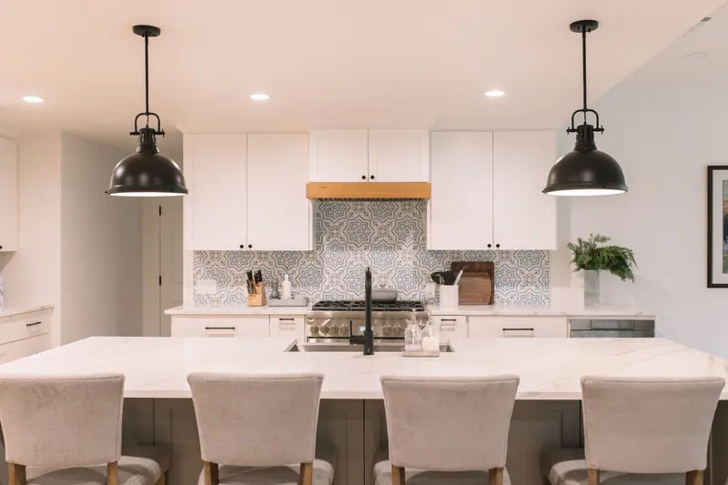
That's exactly what we did at Westcliff. Each space got its own voice. The dining room had one feel. The scullery kitchen had another. The main kitchen had its own tone altogether. The whole house got more layered, more intentional, and — counterintuitively — more interesting to walk through.
The Scullery: "Hide Your Ugly" Space
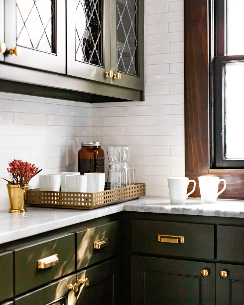
One of our favorite moves on the project was the scullery kitchen.
If you haven't heard the term, a scullery is basically a butler's pantry that's actually useful. A second small workspace adjacent to the main kitchen where you stash all the stuff that makes a kitchen feel cluttered. The coffee maker that lives on the counter because where else would it go. The toaster that's always somehow in the way. The mini fridge for drinks. The KitchenAid you actually use but don't want sitting out. Bulk pantry. Extra storage. The everyday sprawl that makes "I just want a clean kitchen" feel impossible.
We call it "hide your ugly" space. And we've come to believe it's one of the most underrated additions you can make to a home.
We shrunk the main kitchen slightly to carve out the scullery. Less square footage in the main kitchen — but a much better-functioning main kitchen, because suddenly all the stuff that was crowding the counters had a dedicated home. The main kitchen got to breathe. It stopped being a workspace and started being a beautiful, clean, intentional room where you actually want to entertain.
A lot of clients balk at this idea at first. "Wait, you want me to make my kitchen smaller?" Yeah. Because a smaller, cleaner, well-designed kitchen with a scullery behind it lives ten times better than a giant cluttered kitchen where every surface has stuff on it.
This is the layout magic in action. Not more square footage. Better square footage.